 |
||
|
|
GANTT CHARTS : A must-have tool for Project ManagersI. Gantt Charts - BackgroundWhile working on projects as their manager, I have often wondered how managers of earlier generations, before Henry Gantt was born, managed their men, material and money and saw their projects through. Facing stakeholders with reports of slippage and over-budgeting every now and then must have been a thankless job! A Gantt chart is a great way of knowing, at any point of time, where the project is heading. Every time we, as managers, go about doing our job - goading colleague X to complete item M f rom their to-do task that is now threatening to slip, patting colleague Y on the back for a tough assignment executed in time, coordinating with vendor V for supply of items rejected earlier, and liaising with functional heads from customers to make a presentation about the next phase in the project … a silent word of thanks to Henry Laurence Gantt escapes the lips. It is the Gantt charts from where we get our daily guidance. I would add : from where we get our daily bread and butter. When Gantt first presented his heretic idea of charts as a management tool to the world at large, people were skeptic; as they always have been throughout history, whenever they come across something new. But these same skeptic managers observed dramatic improvement in their control over a project's progress after they began building the chart and deploying it in their day-to-day management. Slippages reduced, and planning in advance for the next phases and linking future events with present actions became more objective and focused. Word began to spread, and people began to swear by their charts. Today, Gantt charts are firmly established in management literature, and are part of compulsory learning material in B-schools. II. Gantt charts DefinedLike all simple ideas, a Gantt chart, is quite simple, really. It is just a chart with rows and columns. All tasks that go into completing a project - from start to finish - are written in rows. Alongside the task names, columns are drawn that indicate the dates that may be in increments of days, weeks or months. You decide how you wish to monitor a project’s progress - in days, weeks or months. 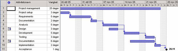 For each task, a horizontal bar is drawn such that its starting edge is in the column of the start date, and its other edge is in the column of the ending date for that particular task. After the last such task has been so represented with its corresponding bar below the start-end date columns, the chart is ready. Simple, isn't it? In one glance, you get to grasp how the days ahead of you as project manager are going to pan out. Some tasks are going to run sequentially: task P cannot start till task J has finished. Others are going to run concurrently, and perhaps the next phase can begin only when both of them are completed: these days are going to be tough, as resources will have to be deftly balanced between these tasks. For a different perspective, you can view your Gantt charts with critical activities in another color: 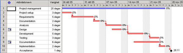 This Gantt chart is showing tasks that are critial with respect to the end date in red. Still other tasks overlap; task L begins immediately after task D is over, but begins x days before task K is officially over: so should Stella of task K be relieved from documentary work on the (x-1)th day itself, move her to task L, and let L’s group leader brief her for the new assignment? Who will manage Stella’s work in task K during those x days? Should the group leader for task K assume responsibility? Or should we bring in somebody else, instead? Whew! You see, the chart forces you to think proactively about different what-if situations in task after task, and arrive at more objective decisions for resource management. And, to think that it is just a chart? Once the project begins, for every working day, the hollow bar of each task that has commenced and is operative is filled up to the extent of the work being completed. On any day, an imaginary “snapshot” line may be drawn vertically on the chart for that date. Tasks whose bars now appear solid and are to the left of the line are completed tasks. Partially-filled bars that are being cut by the line indicate work in progress as on that date. Partially-filled bars lying to the left of the line show slippages. Totally hollow bars that are being cut by the line indicate tasks that are yet to commence - time to wake up! There you are; the entire state of affairs of your project is now before your eyes. For complex projects, of course, things can’t fit into one single page. So each task gets divided into subtasks which are then moved to subordinate charts. Each chart is treated as a project on its own, with back- and front- links that connect it to the parent chart. Indeed, the much-celebrated “Work Breakdown Structure” or WBS concept stands on the strong shoulders of Gantt Charts. WBS is nothing but decomposing tasks into major deliverables; this decomposition continues till individual assignments can be handed out. These charts can also be used to depict major milestones. “Milestone” is different from a “task” on the chart, in that it is an event signifying the reaching of some goal, not any activity. If there are parallel tasks that were running before it, arrows may be drawn from the end-date of each of these tasks, appearing to converge at the milestone. These milestones help in motivating all your team members such as nothing else can - the excitement and hub-hub in the air increases as the D-day approaches near! It is so exhilarating - t o meet, and if possible, beat the D-day for a particular milestone! III. End wordInnovation and creativity go hand in hand, sometimes, in step with each other. More powerful models have been developed that capture the progress of a project, and provide the manager with an efficient handle with which to manage all resources and be warned of slippages in advance. Yet, at the core, they are simply Gantt charts with more bells and whistles. If the project in your hand is organizing that week-end get-together, plain old Gantt charts will ensure that you and your friends enjoy it thoroughly! Return to Software Project Management
|
Exclusive interviews with:
Free eBookSubscribe to my newsletter and get my ebook on Entity Relationship Modeling Principles as a free gift: What visitors say...
"I just stumbled accross your site looking for some normalization theory and I have to say it is fantastic.
Read more
Testimonials
I have been in the database field for 10+ years and I have never before come across such a useful site. Thank you for taking the time to put this site together." Mike, USA |
|
Theory & Practice DB Normalization Analysis Phase Database Keys DB Glossary Appl.Architecture Oracle DBA MySQL DBA SQL Server DBA Install Oracle Install SQL Server Proj.Management Oracle Constraint Programming Tips Database Normalization eBook: |
||
|
Copyright © www.databasedesign-resource.com /
All rights reserved. All information contained on this website is for informational purposes only. Disclaimer: www.databasedesign-resource.com does not warrant any company, product, service or any content contained herein. Return to top
The name Oracle is a trademark of Oracle Corporation. |
||